


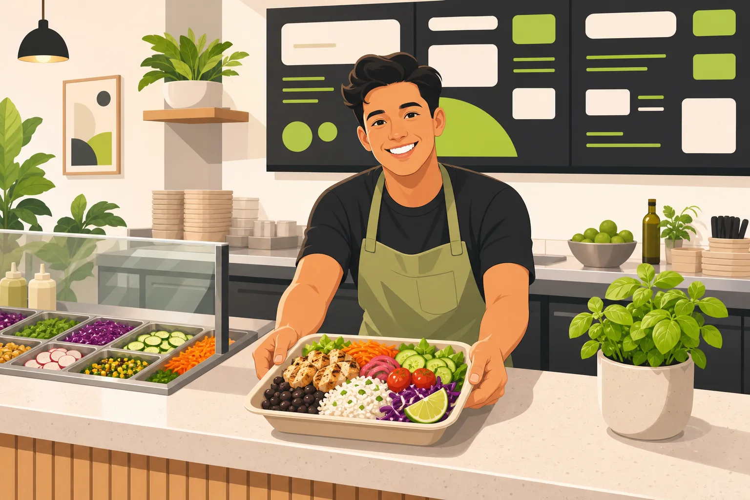
Your menu is not the problem. Most fast casual restaurant owners know their food is good — that's not what's keeping people from walking in or placing an order. What's costing them is a website that ends at the menu page, leaves catering inquiries unanswered, and loads slowly on the phone screen of someone standing outside deciding where to eat. After analyzing fast casual restaurant websites from all over the country — tracking hero CTAs, catering flows, location pages, and what separates the top-ranked spots from everyone else — the picture is pretty consistent. The gaps are specific, and most of them are fixable.
What we found looking at fast casual restaurant websites from all over the country
Looking at sites from Austin to Charlotte to Tampa, a pattern shows up immediately: the best-performing fast casual sites are aggressively simple. They answer three questions before you've scrolled an inch — what the food is, where you can get it, and how to order it — and they put a single high-contrast "Order Online" button where you can't miss it.
Every one of the top-ranked sites had that button: in the nav, above the fold, and again in the footer. The ones that didn't lead with a dominant order CTA were always playing catch-up on everything else.
Equally universal: real food photography. Not stock. Every single site we analyzed used genuine photos — close-up taco shots, pasta in the box, bowl builds, open kitchen moments. Across our proprietary local-business website research, dozens of industry categories showed zero stock photography detected on any top-ranked competitor site. Restaurants are about as strict as it gets. A photo of someone else's food at the wrong angle will cost you more than a blank page would.
The other thing every competitive fast casual site had: an origin story. Two sisters and a trailer in East Austin. A chef who worked in Tel Aviv and New York before opening in Charlotte. An Italian grandmother's pasta recipe made "fresh, fast, authentic." These aren't filler — they're doing real persuasive work, answering the implicit question every visitor has: "Is this the real thing or just another concept?"
Table stakes: what your site must have before anything else
If your site is missing any of these, fix them before worrying about anything else.
One dominant order CTA, above the fold. The button should say "Order Online" or "Order Now," in a different color from everything else on the page — in your nav, above the fold, and in the footer. Third-party ordering platform (Toast, Square, DoorDash) is fine, but the button copy should say "Order Online," not the vendor name. Branding a button "Order on ChowNow" looks unfinished and leaks your ops stack.
Your location(s), hours, and phone on the homepage. Not only on a contact page. Not only in the footer at size 9 font. Fast casual visitors are mostly deciding right now, on a phone, often within a few miles of your front door. If someone has to hunt for your address or hours, you've already lost them to the next result. A sticky address bar or an hours callout near the hero is worth more than most design choices you could make.
Real food photography. Covered above, but worth repeating: if your current photos look like they were taken in bad lighting on an old phone, this is your highest-leverage fix. Not redesigning the site — getting better photos.
A mobile-first menu. PDF menus are the most common silent conversion killer in this category. On a phone, a PDF means zoom-pinch-scroll in low light while someone's waiting for your order. HTML menu pages are indexable by Google, readable on any device, and look like a real restaurant's site. This one matters both for visitors and for search rankings.
The differentiators: what separates the sites that win
Getting the table stakes right puts you on level footing. These are the elements that actually pull ahead.
A catering inquiry page with a real form. Catering is a secondary CTA on every competitive fast casual site we looked at. It's in the nav. It gets its own page. And it almost always uses a proper form — name, event date, headcount, type of event — rather than just a phone number or a generic "contact us" email link. Catering orders have high average values and tend to repeat. A proper catering page is a revenue stream, not an afterthought. A plain lead-capture form with the right fields is enough to get started; you don't need an automated quote calculator.
A clear secondary CTA alongside ordering. The sites that convert well pair their order button with one specific secondary action: catering inquiries, a loyalty/rewards signup, or gift cards. Not all three — one clear second offer, aimed at the visitor who's already decided they like you.
Your origin story above the fold (or just below it). "Authentic Asian bowls your way." "Nashville's original hot chicken, crafted over 100 years ago from Thornton Prince's scorned lover." These headlines do something a generic "fresh, fast, quality" claim can't: they give you something to remember and repeat. The founding story — however simple — belongs near the top of the page, not buried three scrolls down.
Press and awards, if you have them. Only the strongest competitors display real press — James Beard recognition, MICHELIN Guide listings, Condé Nast or local press mentions. Most sites skip this even when they have it. If you've earned a named award or a quote from a publication, it belongs on your homepage, not in an unlinked press release from 2019. Even a local paper's "Best Of" mention, displayed with the publication logo, outperforms five generic star graphics.
Per-location menu pages if you're multi-location. A single "see our menu" page that doesn't distinguish between your downtown and your suburban location is a friction point. The top multi-location fast casual sites we analyzed build separate menu pages per location and let visitors pick theirs from a clear location finder. Visitors don't want the corporate menu — they want to know what the specific location near them is serving today.
Common mistakes worth calling out
Hiding the address. The number one mobile UX failure in this category. Visitors looking up a fast casual restaurant are almost always about to go. The address needs to be readable without hunting for it. If you can't see your address on the homepage on a phone without scrolling, that's the fix.
Hero copy that sells features instead of identity. "Fresh ingredients. Fast service. Affordable prices." Every restaurant in town could put that headline on their site. The best fast casual copy we saw leads with origin, personality, or a distinctive hook — not a checklist of things customers assume are true anyway. Specific always beats generic. "Two sisters. One trailer. Six locations." beats "quality food, made fresh" every time.
No catering page. Specifically: a catering section that's just a phone number, or a line in the footer that says "email us for catering." The operators doing the most catering volume have dedicated pages with a real inquiry form. If you're getting catering calls through a generic contact form, you're making customers work harder than necessary and making your own intake messier than it needs to be.
Photos that don't show the actual food. A mural on the wall and a restaurant exterior can be supporting images. They should not be your hero. The decision a fast casual visitor is making is primarily about what they're about to eat — show them the thing they're deciding about. Food close-ups, bowl builds, sandwich cross-sections. That's what moves people from browsing to ordering.
No hours on the homepage. This one costs more than most owners realize. If someone opens your site to check if you're open right now and has to click to a Contact page to find out, there's a real chance they close the tab and Google someone else instead.
Quick FAQ
Do I need a loyalty program page? If you have a rewards program, it deserves a homepage callout and a signup page. Loyalty turns one-time visitors into weekly regulars — a simple email signup or app download CTA is enough to start.
Should I show prices on the homepage? No. Every fast casual site we analyzed hides pricing on the homepage and pushes it to the menu page or ordering platform. The homepage decision is "do I want to eat here?" — price reveal happens at ordering.
What about online ordering vs. third-party apps? Most operators use both. The key is keeping your website's "Order Online" button the primary surface. Link to your in-house system when you have one, or to your preferred third-party platform otherwise. Don't ask visitors to find you on DoorDash themselves.
How many pages does my site actually need? Not many. Home, Menu, Locations, About/Story, Catering, Contact — plus loyalty and gift cards if you have them. Multi-location sites add per-location pages. Roughly 8–12 URLs total. The sites that rank well are shallow by design.
What your fast casual site actually needs — the short version
- "Order Online" as a dominant, high-contrast CTA: in the nav, above the fold, in the footer
- Address, hours, and phone on the homepage — not hidden in a Contact page
- Real food photography, no stock
- An HTML menu (not a PDF), optimized for mobile
- A real catering inquiry page with an actual form
- An origin/founder story above or just below the fold
- One secondary CTA paired with ordering (catering form, loyalty signup, or gift cards)
- Named press or awards if you have them — displayed with the source, not genericized
- A flat, shallow sitemap with 8–12 pages maximum
The difference between a fast casual website that drives orders and one that just exists is rarely design budget. It's structure, speed, and whether the site answers what the visitor needs to know before they close the tab and Google someone else. The operators who figure this out first get the catering contracts, the repeat weekday lunch traffic, and the Google rankings that come from a site built for how people actually use it.
GrowLocal builds fast casual restaurant websites designed from the ground up for how hungry people actually decide — fast, on a phone, comparing you to two other places. We handle the design, the build, and the hosting, starting at $20–30/month. You see the full site before paying anything. If you've been running a restaurant on a site that wasn't built for your category, take a look at what we put together for fast casual restaurants specifically. We also build for adjacent food businesses — catering companies that need real inquiry flows, and cafes with their own conversion patterns. See the full range of local business websites we build.